reference image generation
Reference Image AI Generation Workflow
How to use visual references to control composition, lighting, mood, and campaign consistency without copying another brand’s work.
By DOBIDOBI Editorial Team·8 min read·Updated
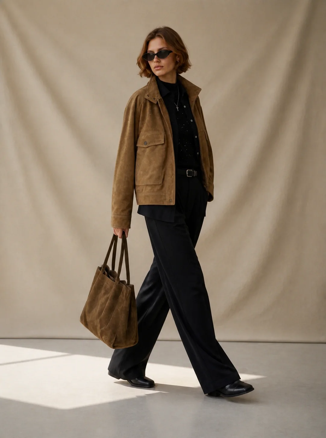
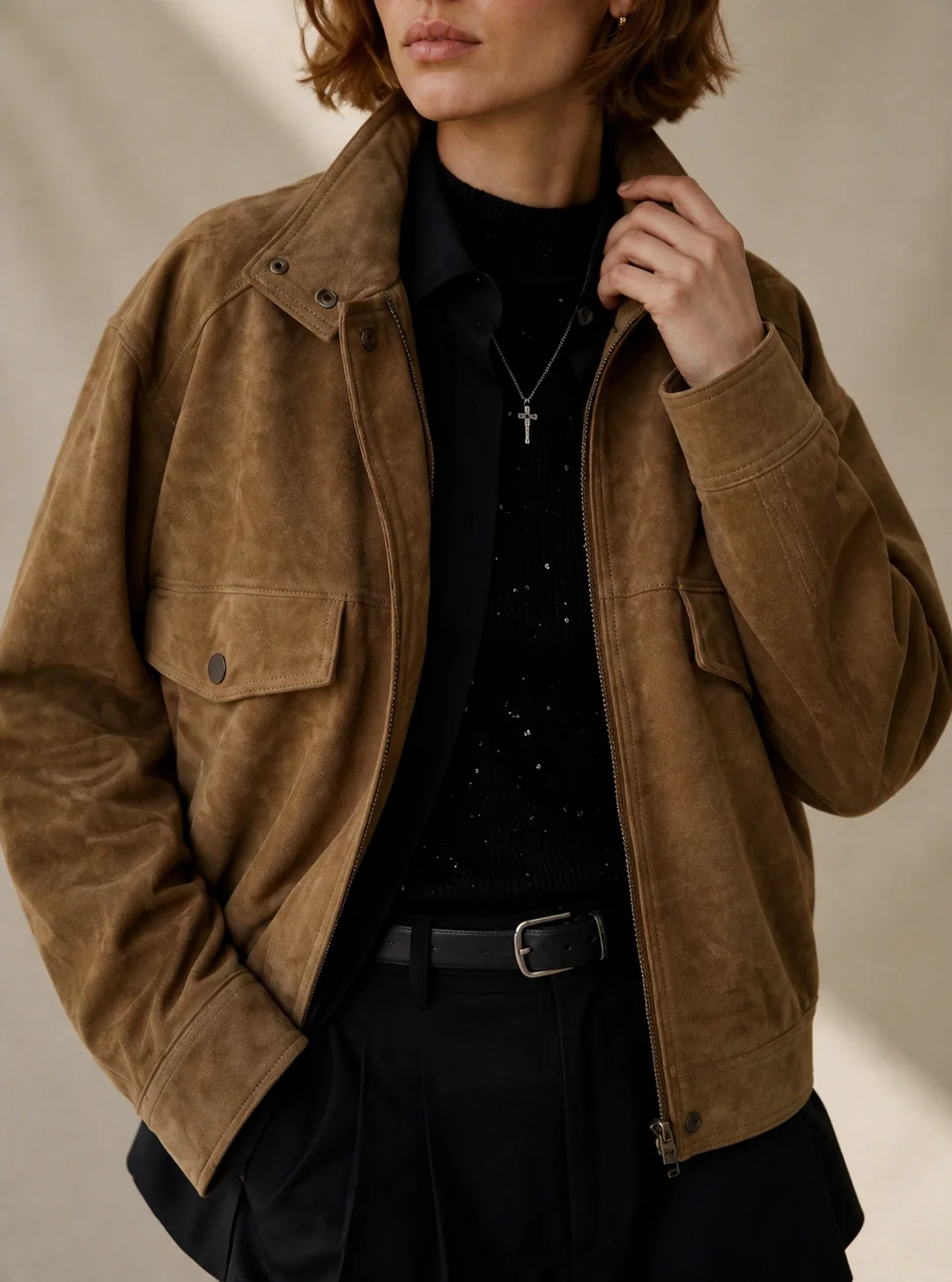
Key takeaways
- Separate product truth from visual direction.
- Describe what you want to borrow from a reference, not merely what is pictured.
- Lock a direction before generating a full asset set.
- Review for brand fit, product accuracy, and unwanted imitation.
- Save approved references as a reusable visual system.
Why reference images are useful
Text prompts can describe a mood, but visual references communicate relationships that are difficult to express precisely: camera distance, light softness, background density, color balance, negative space, and styling rhythm.
A reference should guide the visual system—not replace the product source. Use a clear product image to preserve the item and a separate reference to shape the scene. This separation makes the workflow easier to review and repeat.
Choose photoshoot references that answer the brief
Before building a photoshoot moodboard, separate product facts from the visual direction. Product facts include the item’s shape, material, color and details. The direction describes light, setting, composition and mood. Give each reference a specific job and a reason to keep it.
Illustrative reference note — not a client approval record
Use the soft side light and restrained grey palette. Keep our bag’s silhouette and hardware. Remove the ceremonial props; the theme should come through an ordinary moment.
- Keep: a reference whose side light makes leather texture readable. Specify that the lighting is relevant; the reference bag is not your product.
- Keep with changes: a composition with useful space for copy, but ask for a quieter background if the scene competes with the product.
- Exclude: an image whose wedding symbols, heavy effects or hidden product details conflict with the brief, even if its overall mood is attractive.
Compare directions with the client before saving a Style
Present each direction against the same brief: its theme, key references, the role of each image and the changes needed for the actual product. Ask which direction to develop and what must change. Record the feedback in the project before selecting references and packaging Styles.
A direction-review checklist to copy
Direction to develop: …
References to retain and why: …
Product details to preserve: …
Changes requested: …
Still to confirm: …
- Separate feedback on the product from feedback on light, mood, scene and composition.
- Make the decision explicit: selected direction, retained references, requested changes and unresolved questions. Selecting images in DOBIDOBI records an operator action; it does not establish that an external client approved them.
- After confirmation, save the chosen Style and try it on the next product. Review each output against that product’s source image.
From a fashion moodboard to a reusable Style
Start in Explore with a short collection brief. Ask for two visual directions, compare the reference boards, and select the images whose lighting and composition you want to use. The reference garment is inspiration; your product photo supplies the item to depict.
A brief to try in Explore
Explore two autumn campaign directions for a womenswear brand: warm tactile interiors and clean architectural minimalism. Show comparable reference boards in English. Explore references only for now; I will choose a Style and upload my product next.
- Select references, click Continue, then Organize and package styles.
- Choose a resulting Style and save it to My styles for later use.
- Add your own product photo, describe the shot and the product details to preserve, then generate one sample.
- Review the result against your source photo. In this project, we selected the same Style and attached only its generated jacket sample to request a correction; the original product photo was already part of the project.
- For another product, select the saved Style again and attach the new product photo. Check the new result separately.
Worked example: select, generate and review a jacket campaign
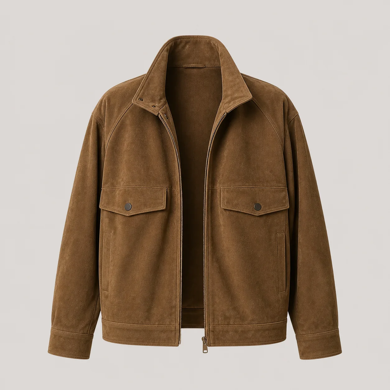
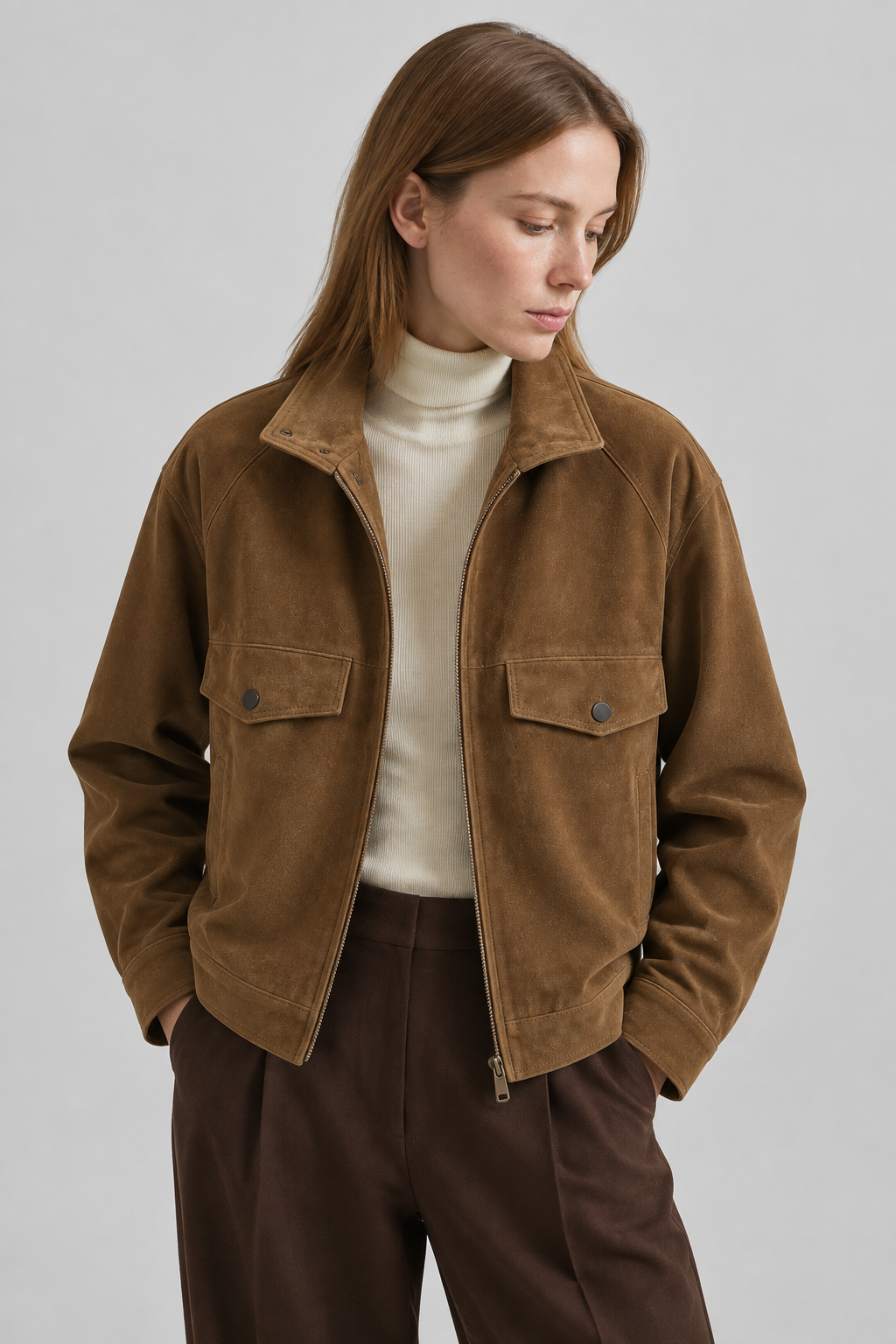
This DOBIDOBI demonstration was made in a new project on September 13, 2026. It is a product test, not a client campaign. We explored two boards, selected two references, packaged them into Styles and saved Warm Earthy Studio Portrait.
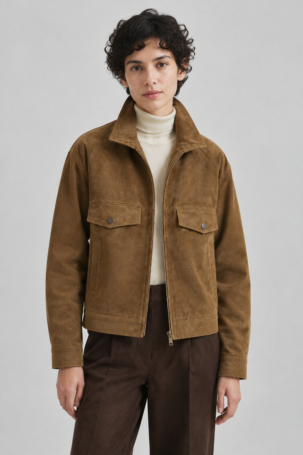
The first sample used the original brown jacket with a grey studio setting and soft light. In the final verified edit, we selected the same Style and attached only that first generated sample. We asked for short curly black hair, a forward gaze, relaxed arms outside the pockets, and visible lower vertical welt pockets.
The final image shows the requested short black curls, forward gaze and relaxed arms. Both chest flap pockets with dark snaps, the open zipper, brown suede-like surface and lower vertical welt pockets are visible. The lower pocket at the right edge of the image is narrower and less clear than the left. This verifies these requested changes in this example; it is not proof of exact reproduction for every garment or approval for a product listing.
Reuse the saved Style for a second product
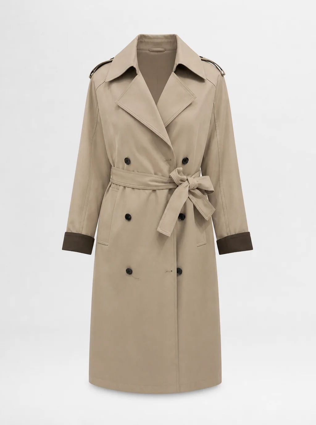
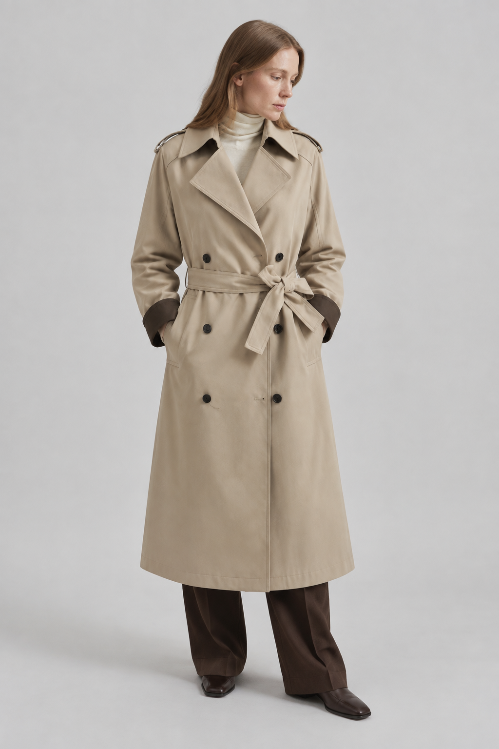
We kept Warm Earthy Studio Portrait and replaced the product attachment with a beige trench coat. The new result uses the same grey studio and soft light, with the coat hem in frame. The double-breasted dark buttons, tied belt, wide lapels, epaulettes and contrasting brown cuffs are visible.
The new image depicts the trench coat rather than the previous brown jacket. This demonstrates reuse of a visual direction across these two products; each result still needs its own product-accuracy review. It does not establish the same outcome for every garment or a fixed model identity.
Step 1: identify the job of each input
Not every project needs four images, but every input should have one clear job. When one image is expected to control everything, the output often drifts.
- Product source: defines the item that must remain accurate.
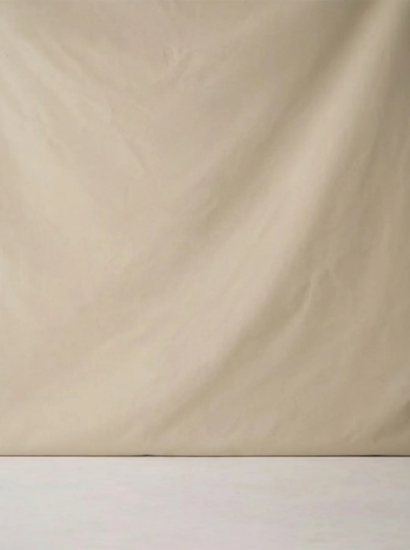
- Scene reference: guides environment, composition, camera angle, and lighting.
- Brand reference: guides palette, visual restraint, styling, and overall tone.
- Channel reference: shows the practical crop, safe area, or layout required for the final placement.
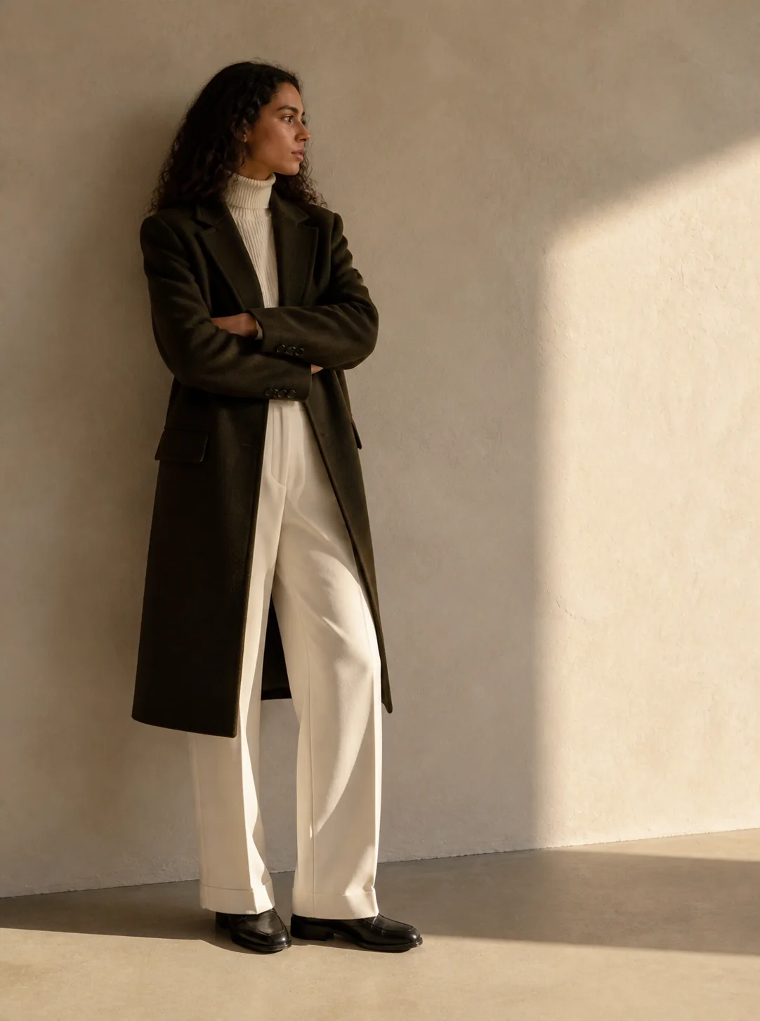
Step 2: translate the reference into visual decisions
Before generating, write down the transferable qualities of the reference. This exercise helps the team agree on direction and reduces accidental imitation. The goal is to recreate visual principles in the brand’s own system, not to duplicate a specific image.
- Composition: centered, asymmetrical, close crop, or full body.
- Camera: eye level, low angle, overhead, or macro.
- Lighting: soft daylight, hard flash, rim light, or studio gradient.
- Palette: warm neutral, high contrast, muted, or monochrome.
- Background: minimal, editorial, environmental, or textured.
- Energy: quiet, playful, premium, technical, or nostalgic.
- Negative space: location reserved for copy or interface elements.
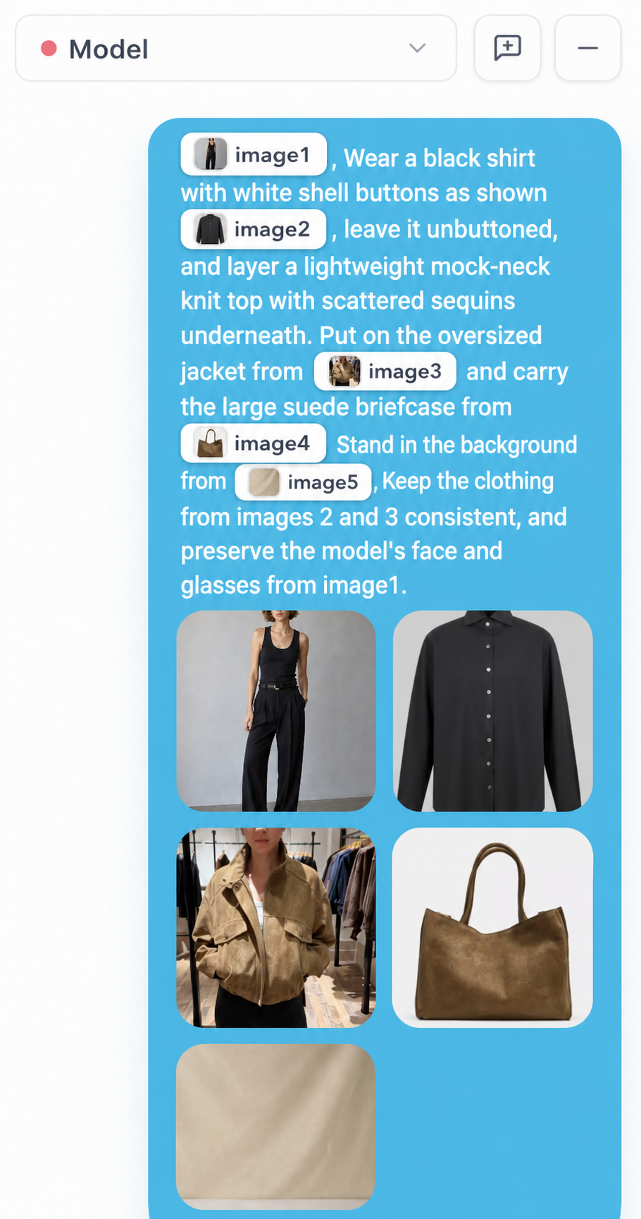
Step 3: test one variable at a time
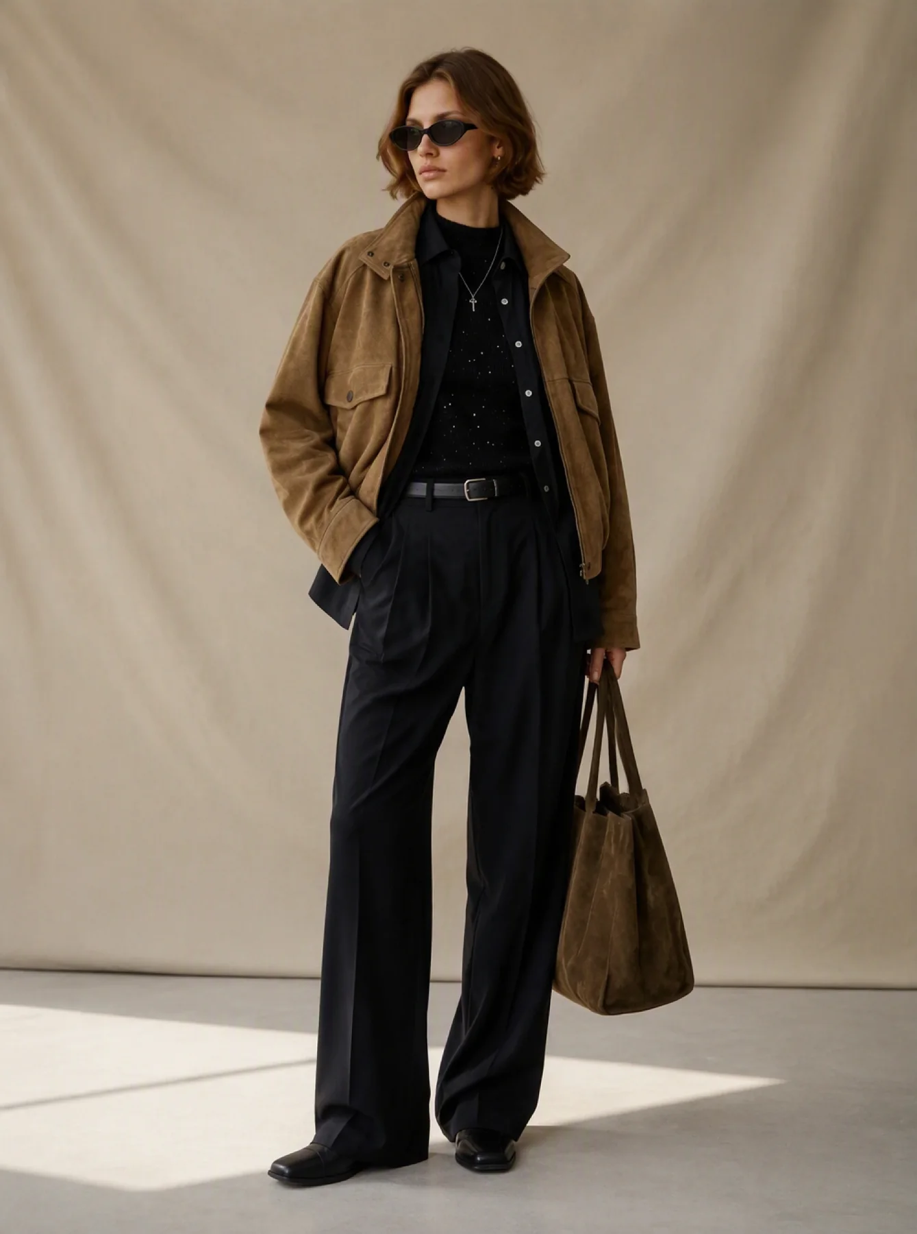
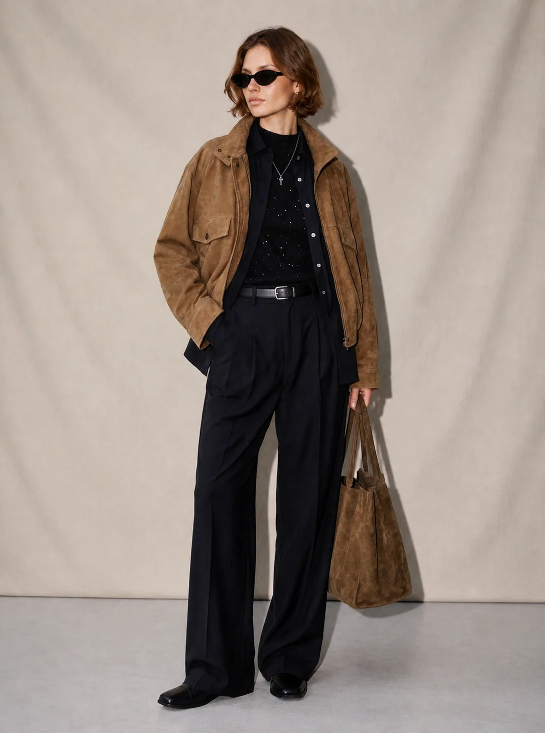
Generate a small comparison set. Keep the product fixed and test two or three scene or lighting options. After selecting the strongest direction, keep that reference stable while expanding into new products, angles, or formats.
If every generation changes the product, model, scene, lighting, and crop simultaneously, the team cannot tell which decision improved the result.
Step 4: review reference influence
Reject outputs that reproduce distinctive logos, text, identifiable characters, or highly specific creative elements that should not be carried over. Teams should use references they own, license, or are otherwise permitted to use and should review the resulting assets before commercial publication.
- Is the product still accurate?
- Does the output reflect the intended visual qualities?
- Does it feel like the brand rather than a copy of the source?
- Can the direction work across a full campaign set?
Step 5: turn the approved reference into a system
Save the reference alongside a short direction note. Record the approved palette, lighting, camera logic, background density, and channel crops. Reuse that package when generating the next product or campaign asset.
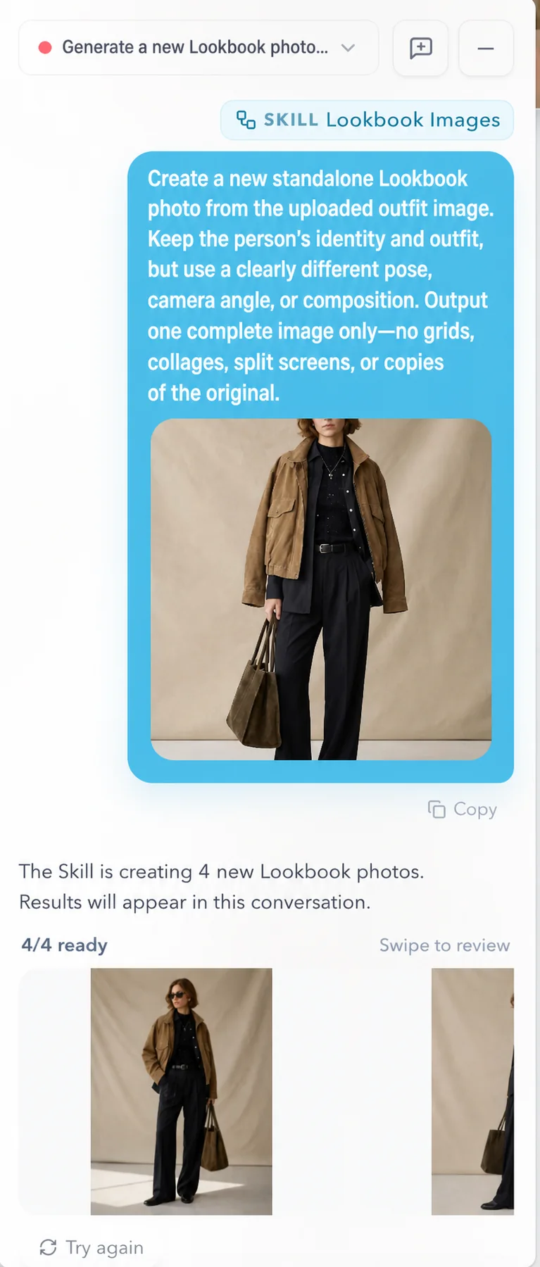
A reusable direction can support product photography, fashion model images, a lookbook, ad variations, and an approved still for image-to-video. The value comes from consistency across the set—not from a single surprising image.
Common mistakes to avoid
- Using a copyrighted campaign as a copying instruction instead of extracting general visual qualities.
- Combining references that give conflicting scene, light, and styling directions.
- Relying on vague labels such as “luxury” or “cinematic” without describing light, palette, framing, and texture.
- Changing the reference after every image instead of creating a coherent set.
Decision table
Roles of references in an AI workflow
| Reference type | Controls | Should not control |
|---|---|---|
| Main style reference | Light, color, composition, mood | Exact product details |
| Product reference | Shape, material, proportion, close-up details | Scene mood |
| Channel reference | Ratio, layout, safe area | Brand taste |
| Case reference | Team alignment and comparison | Copying third-party creative |
Checklist
Reference workflow checklist
- Every input has one defined role.
- The product source is clear and accurate.
- The reference has been translated into specific visual decisions.
- The output is original and appropriate for commercial review.
- The approved direction can scale across products and channels.
- Product details, text, logos, hands, and backgrounds have been checked.
FAQ
What makes a good reference image?+
A useful reference clearly communicates the visual quality you want to control, such as composition, light, palette, or setting. It should be relevant to the final channel and legally appropriate for your use.
Can I use more than one reference?+
Yes, when each reference has a distinct job. Avoid multiple images that give conflicting directions.
How do references improve consistency?+
They give each generation the same visual anchor. Combined with a fixed product source and written direction, this reduces random changes across a campaign set.
Explore a direction for your next collection
Open Explore, describe your collection, choose references, and turn the direction into a Style before adding your product photo.
Start in ExploreKeep reading